



Teamwork
INSSPIRES US
ever since
WE WERE BORRN
Together we share responsibilities and multiply successes and, with this philosophy, over the years our group has grown far beyond our imagination. Today, NeedNap's internal technical and creative team is supported by several external partners who complement us and help enrich our offering.
Over the years, some synergies have become particularly strong, such as those with Favret&co and Con Parole Tue. Favret&co is a team of creatives and lateral thinkers, specialists in brand identity and advertising in general, with whom we started working in 2020 thanks to the COLLABOARD project. Con Parole Tue is a network of language professionals we met more recently, who join us whenever we find ourselves stuck in front of the most typical of questions: how do we write this?
Both of them, while maintaining a separate and independent identity from NeedNap, are our partners for everything related to branding projects.
What is branding, exactly?
Easy to say,
HARDERR TO DO
In a world saturated with marketing, the consumer is increasingly overwhelmed. If it's true that a consumer's purchasing decisions are now based on just a few seconds of observation, it becomes clear how essential it is for the branding to be strong and well-designed from the outset.
The project was called YOUPAPARAZZ and it was a platform that gave registered users the chance to turn into paparazzi, posting photos and articles about celebrities they encountered on the street.
The articles, called Youpscoop, were shared by the community on social media and generated a huge volume of comments and shares, given the enduring appeal of gossip in Italy and the added ability to discover the locations of celebrity sightings through interactive maps.
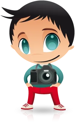
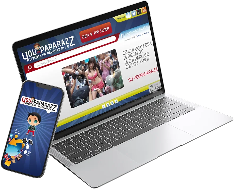
The work on YOUPAPARAZZ covered the complete development of the project, with particular attention to the design, the creation of the logotype and of Youp, a illustrated character — part comic, part cartoon — the antithesis of the serious and unlikable professional paparazzo.
The YOUPAPARAZZ platform — developed by the Swiss company as an outsourced project — centralised all content coming from the mobile app (built for iOS and Android), social channels and geolocations. The entire communications effort was managed by a mini editorial team that filled Facebook, Twitter, Pinterest, Google+ and Youtube with content, running guerrilla marketing campaigns and attending social events. Influencers weren't a thing yet, but the direction was exactly the same!
The work on YOUPAPARAZZ covered the complete development of the project, with particular attention to the design, the creation of the logotype and of Youp, an illustrated character — part comic, part cartoon — the antithesis of the serious and unlikable professional paparazzo.
YOUPAPARAZZ's strategy was built on solid foundations, drawing from the world of traditional communication with a strong experimental component: a constant drive to think laterally and approach emerging situations with an innovative mindset. It was a wonderful adventure that lasted just over a year, but gave birth to and nurtured a new product in an unexplored, highly dynamic sector — probably a little too ahead of its time for the still-immature social media landscape in Italy.
From the world of
celebrities to
LUXUURY
craftsmanship it’s a short step,
at least in the imagination. In practice, for the creatives at Darkside adv this meant immersing themselves in a new world: that of riding boots for both amateur and competitive equestrians.

The brand was SERGIO GRASSO, a family business nestled among the hills of Valpolicella, led by the owner himself — head of product and master craftsman in the making of every boot — and by his daughter Monica, in charge of communications and external relations. The meeting with Mr Grasso was a moment of true inspiration, sparking the ideas that led to the brand repositioning: a jewel of craftsmanship and near-century-old knowledge that needed to become more "interesting" and increase its perceived value.
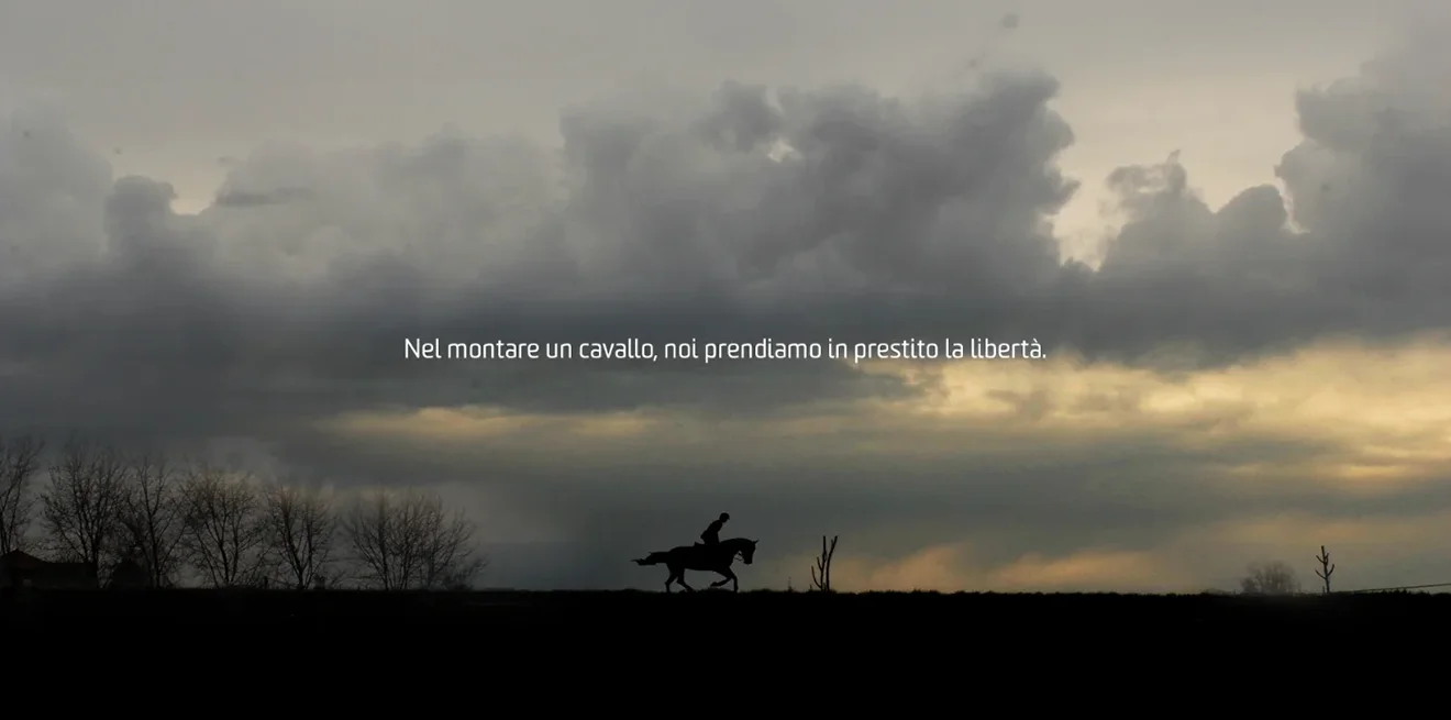
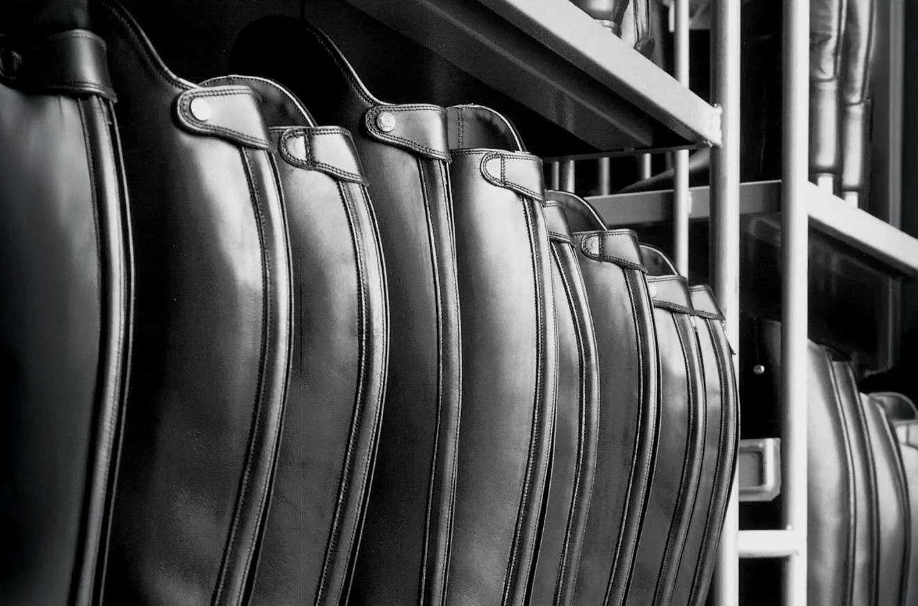
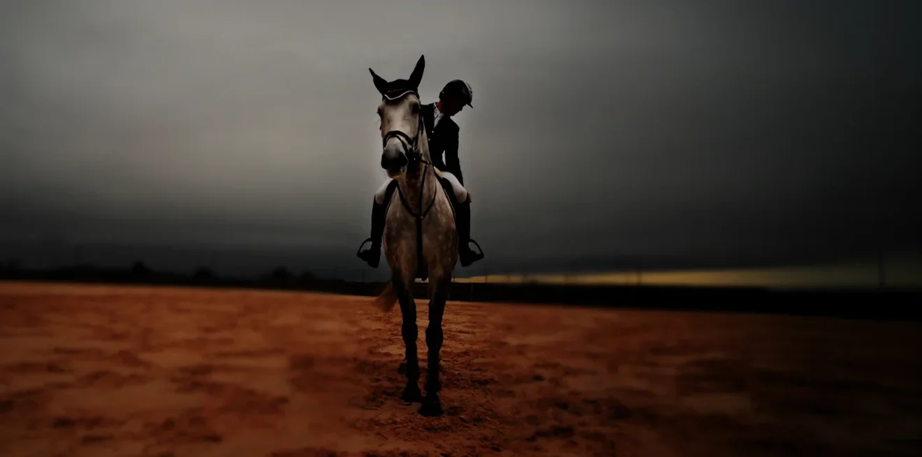
Starting from a complete logotype redesign, stripping away the superfluous and defining the essence and core of the brand, we highlighted the love for craftsmanship and horses.
These values became the driving force behind the entire communications and new positioning. Following the logo redesign, the Darkside adv creatives worked on the packaging and a brochureaimed at evoking emotion while conveying the company's obsessive attention to detail.
Page after page, each boot was presented with a detailed table of specifications taking into account the rider's height, weight, aerodynamics and posture depending on the horse. A truly distinctive brand trait, since none of the competitors offered anything similar to their clients.

Research in this sector led to a deep understanding of the sporting and competitive dynamics of equestrian sport, and an appreciation of the elegance and professionalism that define this world. For the brochure, the new trade fair communications materials and the new website, photo shoots and video content were also produced.
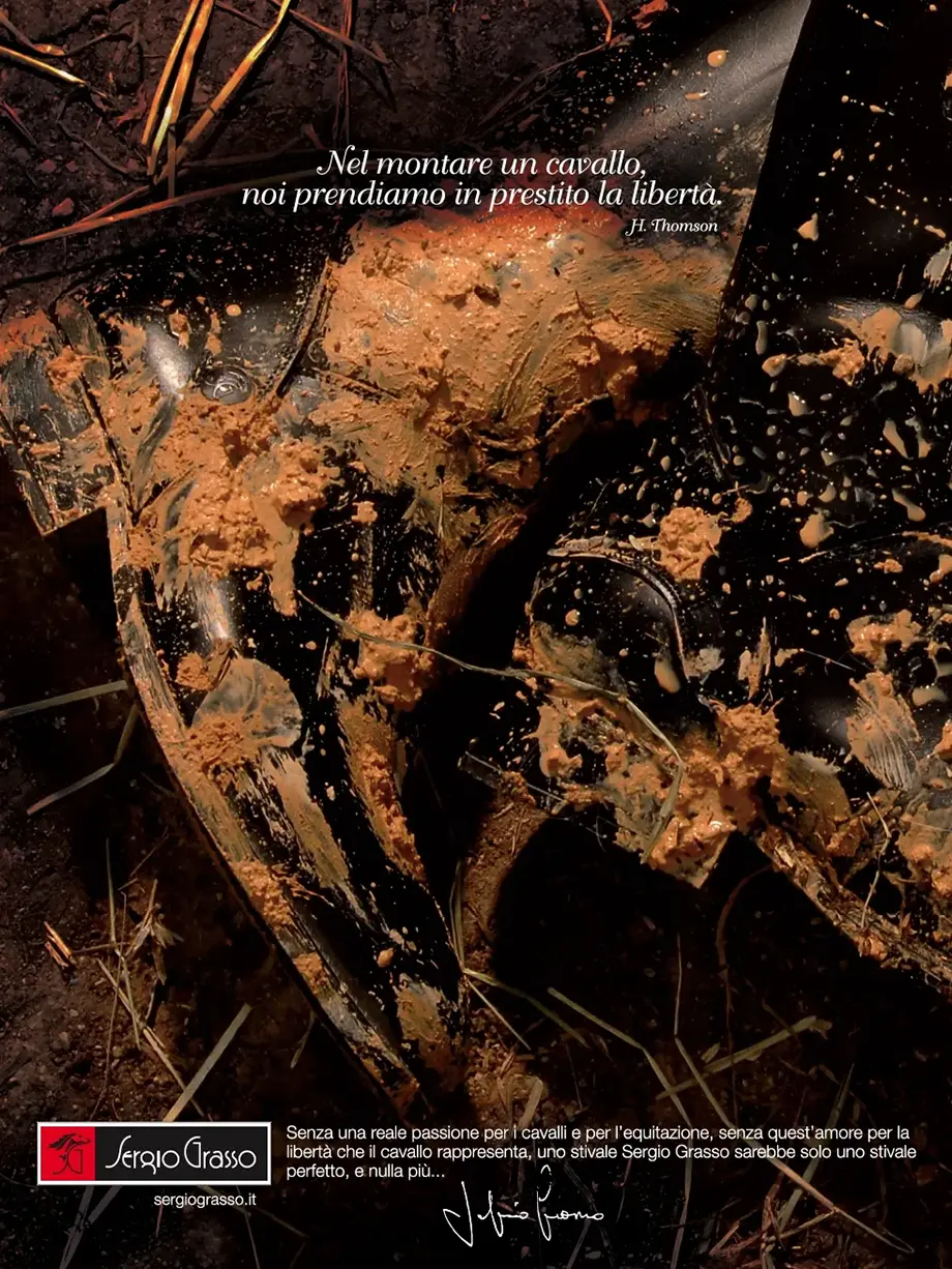
SERGIO GRASSO was also the subject of one of the most lateral and creative advertising campaigns in the sector. The creative concept featured the boot — but certainly not as we are used to seeing it.
Rather than brand new and polished, it was proudly on display worn and muddy. The powerful image underscored the quality and craftsmanship of a product made and designed to withstand the most extreme challenges and accompany the rider through every adventure.
A literary quote borrowed from Thomson completed the picture, and the headline made the campaign iconic.
The world of footwear is a
noble ambassador of
MADEE IN ITALYaround the world.
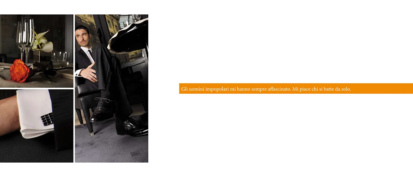
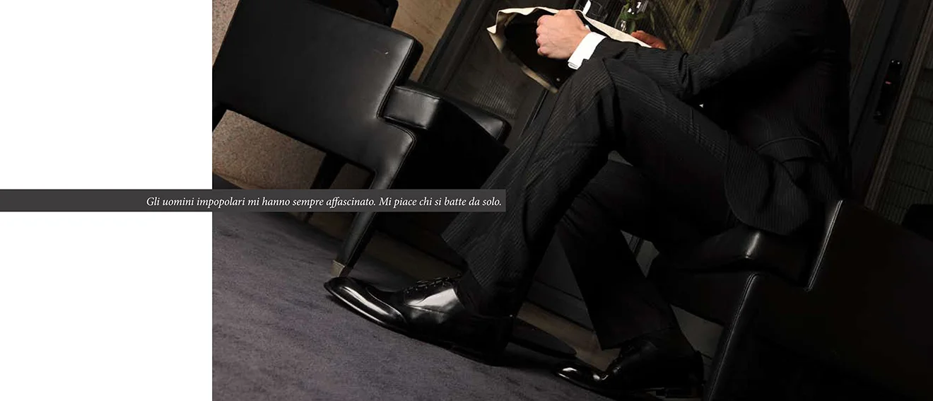
BARRETT is a family business in the heart of Parma, founded in 1917 and, from its very beginning, emblematic of mastery, style and the constant pursuit of perfection. The brand's need was one of positioning: its communications needed to match the high qualitative standards of the product, aligning with the audience's perception of excellence.
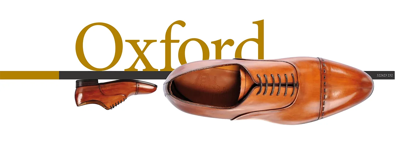
From there, the redesign journey led by Alberto Favret, then creative director at Darkside adv and today at Favret&co, began to take shape. The interventions were numerous: from the logo, with the aim of stylistically renewing the brand without losing its identity, to the creation of a minimalcatalogue, printed on premium papers.


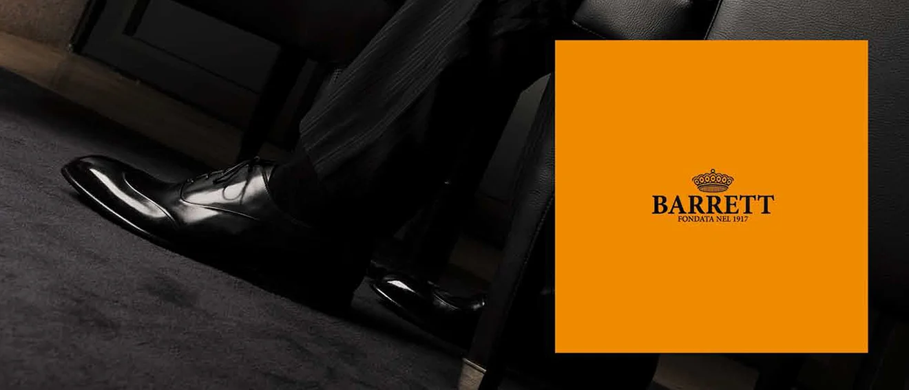
To convey a sense of luxury and exclusivity, a photo shoot was produced in an exclusive location in the heart of Milan, just metres from the Galleria Vittorio Emanuele: the Park Hyatt. The creation of the website and the development of the full coordinated image conveyed the corporate identity, while various print advertisements spread the brand's craftsmanship and values far and wide.
After the pandemic years,
remote work has become a
WIDDESPREAD REALITY
Designing at a distance while keeping team engagement levels high is the challenge that Favret&co and its collaborators tackled with COLLABOARD, a collaborative whiteboard launched in 2020, combining the "anytime anywhere" philosophy with the highest security standards.
To take off, COLLABOARD needed to shine a spotlight on itself within a niche but rapidly growing international market. For this reason, it was essential to develop a solid concept that would position the brand in a new and distinctive way relative to its competitors.
From the very beginning, for the purpose of correct positioning, it was important to emphasise the possibility of bringing together countries and cultures that are very distant from one another, fostering exchange and validating everyone's ideas. And the payoff did the rest: "Great minds think together" reinforced the importance of shared thinking in the birth of the best ideas. The logo creation process went in the same direction and lasted over four months, running in parallel with the work of identifying the heart of the brand and the uniqueness of the service offered.
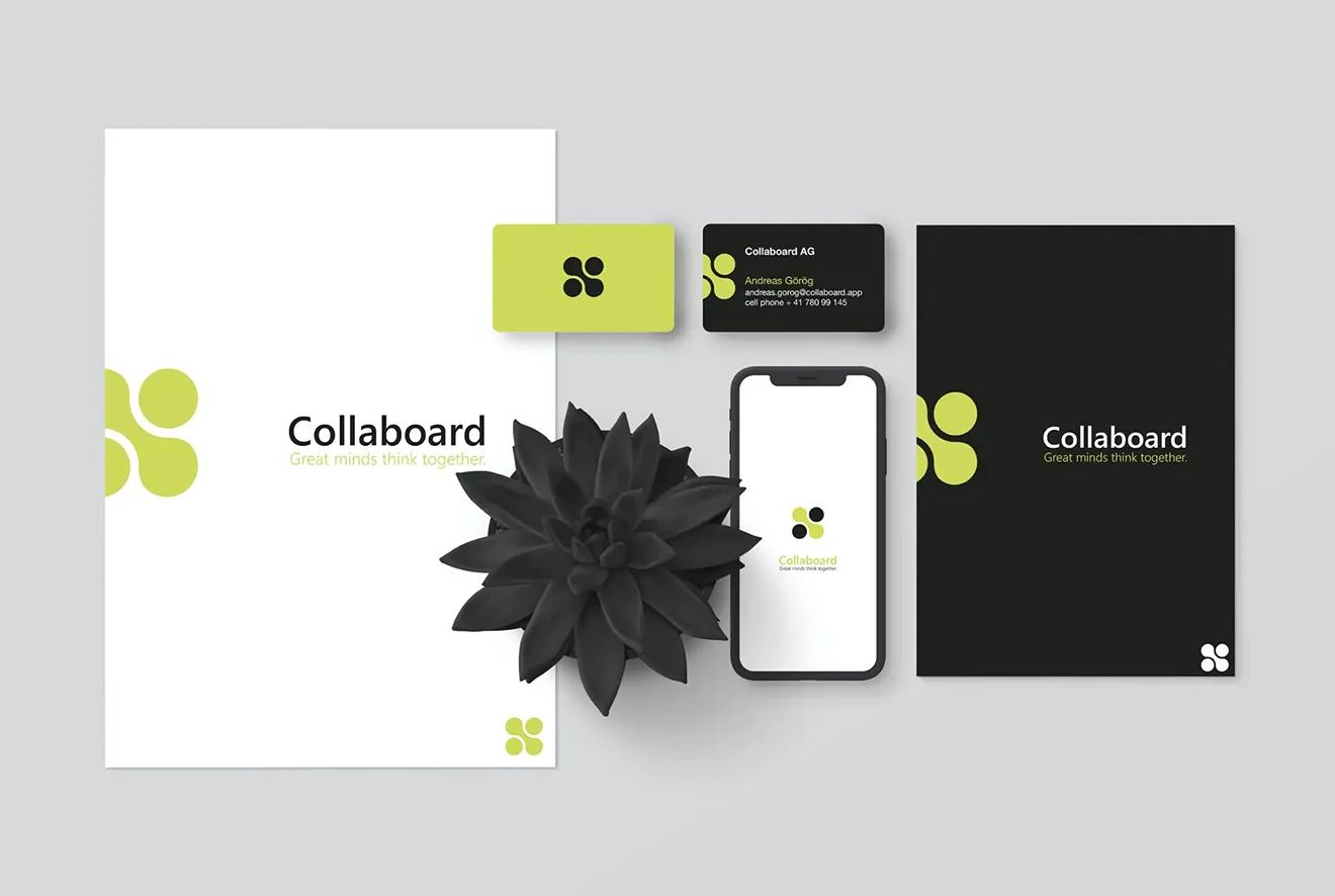
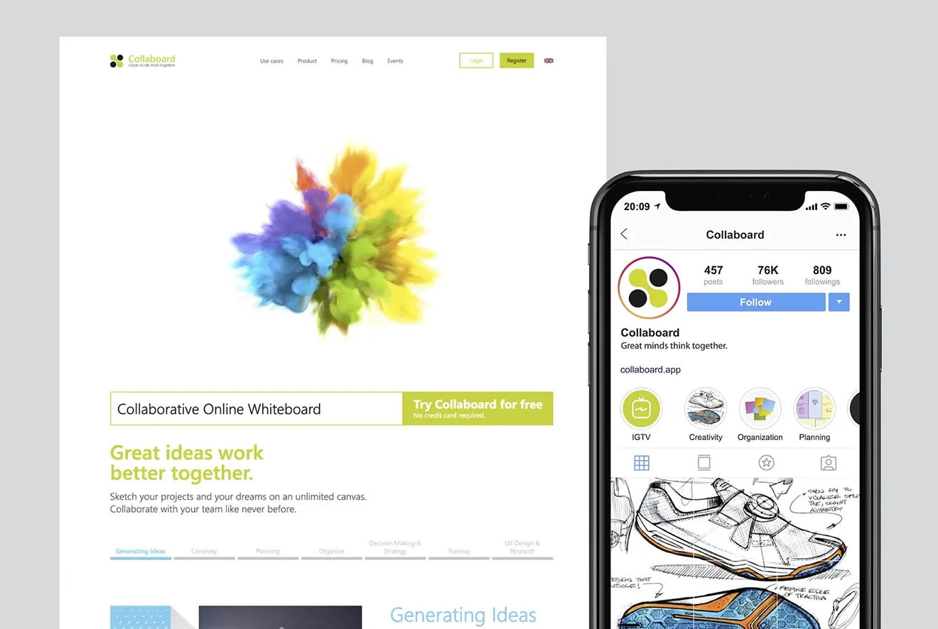
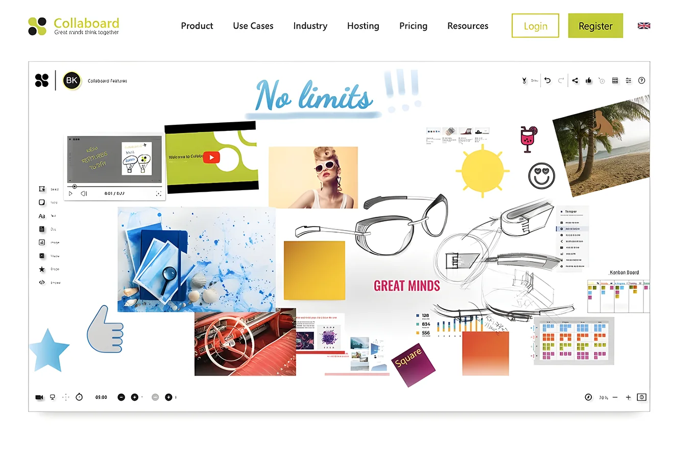
For the launch of COLLABOARD, it was essential to build the entire brand identity, both internally and externally, rolling out the visual and narrative direction in a coherent and unified way, from the corporate level through to web and social communications. The creation of emotional videos followed the same direction, and what Favret&co developed is an engaging visual narrative that allowed the brand to connect with end consumers through fresh, immediate content.
Three years after its launch, COLLABOARD is already among the top five most cited brands in the sector.
Art and science aren't really
THAT FAAR APART,
which is why, at times, it has happened to leap from one to the other and find new horizons and perspectives. In the medical-scientific field, adv had the opportunity to work with the number one brand for the distribution of medical and dental supplies: HENRY SCHEIN.
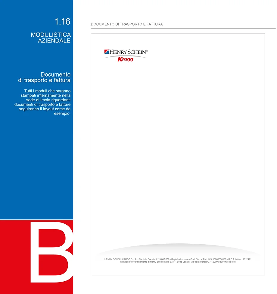
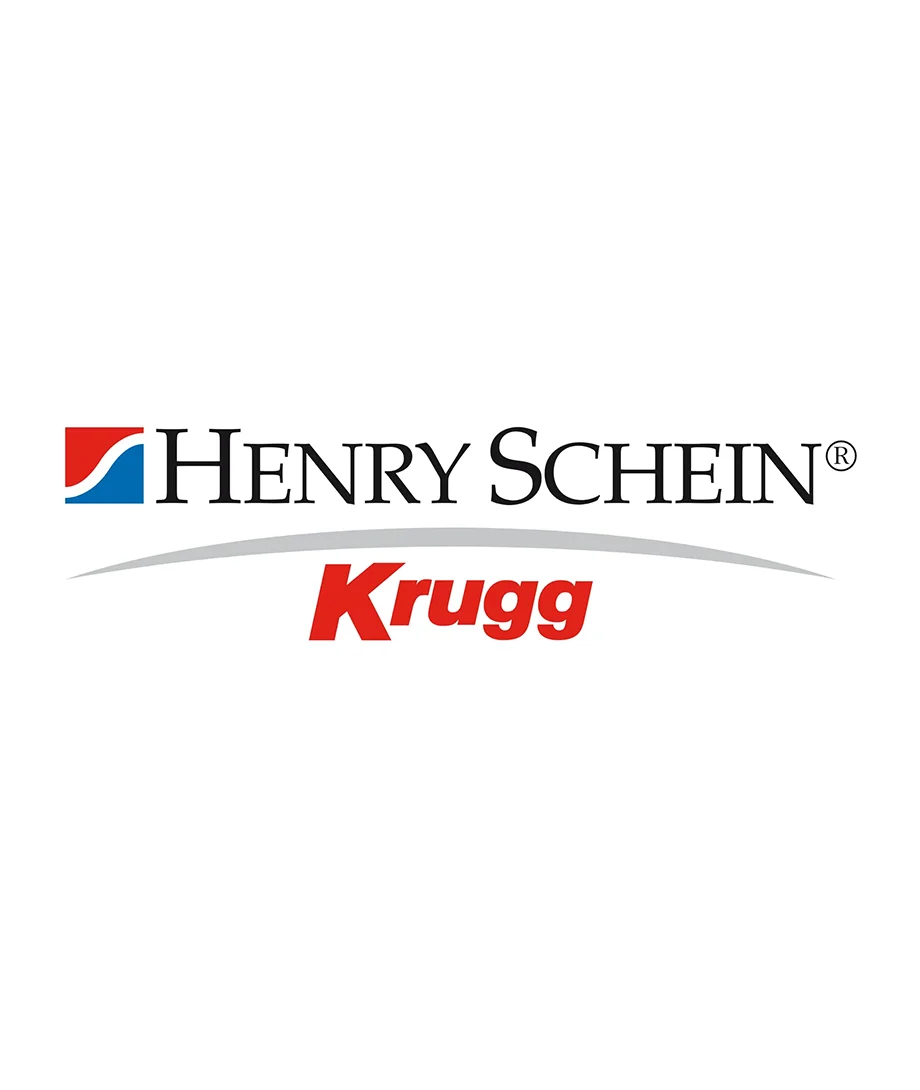
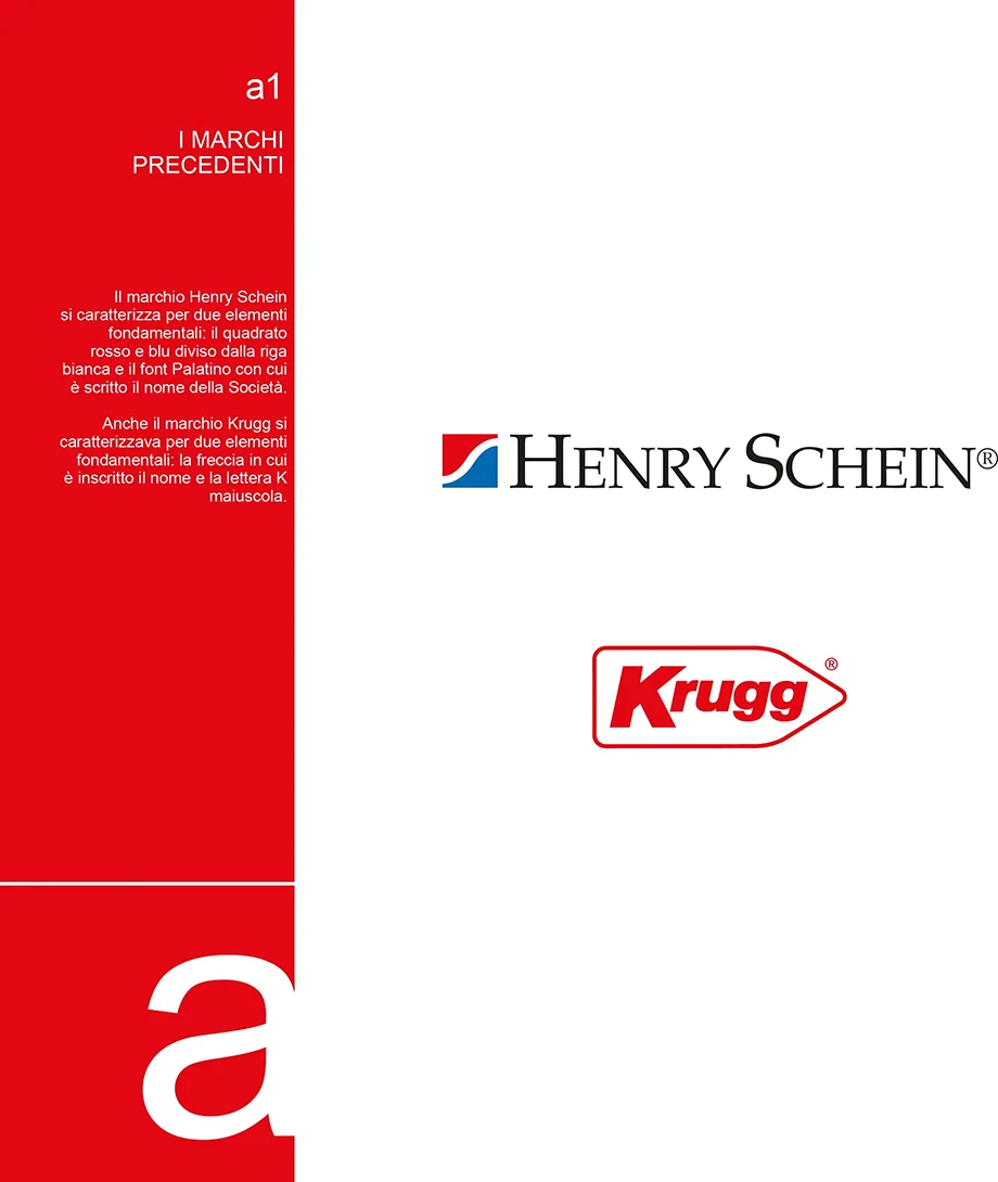
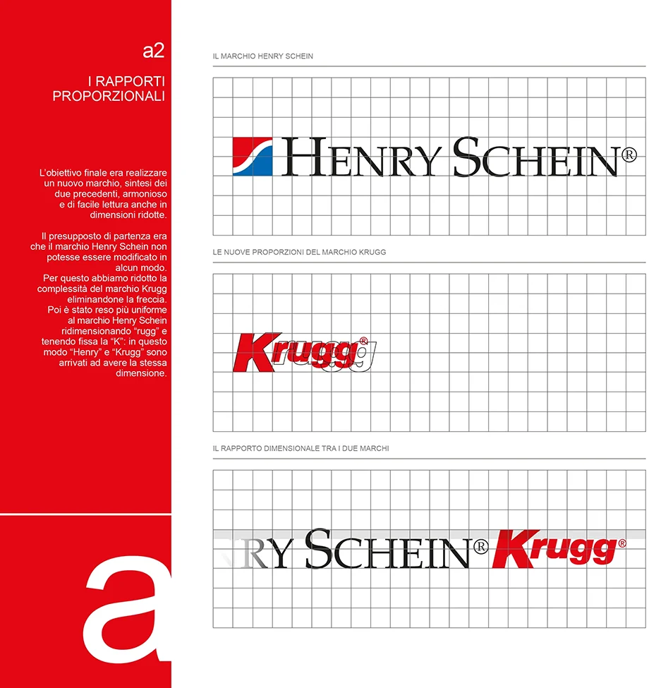
The process was long and not without its obstacles, but after in-depth analysis of the communications of both, the final result was very well received. The solution was to keep both logos, connecting them with a new graphic element that worked for both. The neutral element chosen represented a kind of embrace between the older brother (Henry Schein) and the younger one (Krugg), as well as a sort of crescent moon — as if signalling a new dawn and therefore a new beginning, in keeping with the metaphor of the business acquisition.
From that point on, the work focused on building the coordinated image and the new brand guidelines: a document encompassing all internal communications materials (emails, internal signage, wayfinding, signboards, company uniforms) and external ones (folders, advertising, catalogues, websites, event stands).
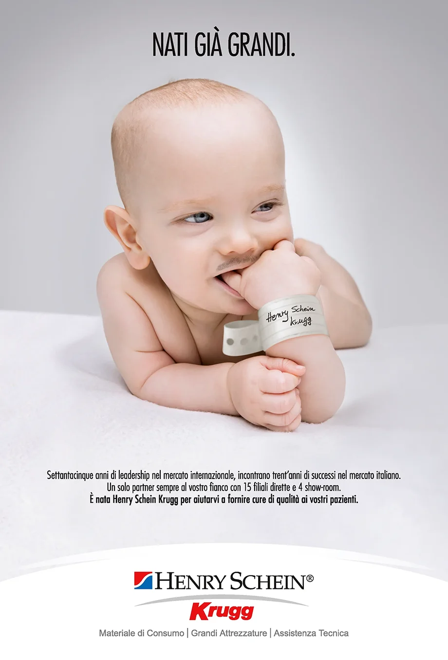
For the advertising campaign through which the company announced the union of Henry Schein and Krugg to the entire sector, ample room was given to creativity. The result? A success at international level and, as a consequence, a decade-long collaboration for the development of the brand's catalogues.
From that point on, the work focused on building the coordinated image and the new brand guidelines: a document encompassing all internal communications materials (emails, internal signage, wayfinding, signboards, company uniforms) and external ones (folders, advertising, catalogues, websites, event stands).
OVERVIEW
Internal expertise and synergies
Creativity, strategy and visual identity
Graphics, brand identity, logotype, packaging, video editing, shooting, copywriting and advertising
DIGITAL YOUPAPARAZZ
Concept, logotipo & mascotte
"Participatory journalism" platform + community
Project design, logotype and tone of voice
Creation of Youp: illustrated character (friendly, pop)
Social content + experimental dynamics (pre-influencer era)
Logo DesignMascotteSocialCross-media
LUXURY SERGIO GRASSO
Repositioning & premium materials
Logotype restyling: essential, authoritative, contemporary
Storytelling of craftsmanship + equestrian culture
Premium brochure, packaging and trade fair materials
Lifestyle ADV: "lived-in" product to highlight durability and quality
The strong imagery underlined the quality and craftsmanship of a product born and designed to withstand the most extreme challenges
RebrandingPackagingBrochureADV
MADE IN ITALY BARRETT
Luxury, coordinated image, catalogue
Repositioning: communication aligned with the product's level
Logo refinements without losing its identity
Minimal catalogue on premium paper stock
Photo shooting + print materials + corporate declinations
Brand RefreshCatalogueCorporateEditorial
PRODUCTIVITY COLLABOARD
Identity, payoff & global communication
Brand IdentityPayoffGuidelinesVideo
MEDICAL HENRY SCHEIN
Post-acquisition rebrand & brand guidelines
Merging Henry Schein + Krugg logos: balance and continuity
"Neutral" graphic element as a bridge between the two worlds
Building a complete coordinated image
Brand guidelines: internal + external materials + advertising
Brand SystemGuidelineADVCorporate